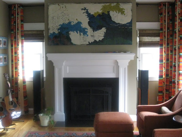
Look familiar?! I see it all of the time. A myriad of color choices, flat builder's paint on the walls and a perplexed homeowner. There was no question the old paint had seen better days and my client really wanted to change the color and make some slipcovers for her chairs..........I couldn't help but interject that what the room really needed to pull it all together was some window treatments. Clearly, my client has great fun taste and is not afraid of color. Here is the rug that was already in the room:
Such amazing color and print! And the room had great pieces. Check out the orange chairs and amazing art above the fireplace:
 |
| This is the BEFORE!! |
Just perfect with that rug!
And here they are:We did a little furniture shuffle and added some turquoise frames on the wall.
The homeowner is still working on a coffee table, but the effect of the drapes makes the room feel much more finished and ties all of the color together.
I'll keep you posted when the room is complete.
Needing help deciding how to finish your room?
I'd love to help!


No comments:
Post a Comment