11.11.2014

Getting ready for guests

It's a room that sometimes doesn't get much use, but when you need it, you want it to serve its purpose well: the spare bedroom. This is the time of year that I get the most inquiries about finishing bedrooms from clients preparing for the holidays. Thankfully, this client caught me just in time for a quick redo before her company arrived.

We started with a very blank slate.
My client already had a duvet cover with great color to use as a jumping off point.

I found a quilt in a fabulous deep magenta that matched the bedding exactly and some earthy throw pillows to soften the bed (a new upholstered headboard is in the works).
We used the warm gold color for the walls and linen window treatments.
Wall sconces provide light without taking up space on the narrow nightstands.
The room is now warm and inviting.
We relocated a mirrored armoire from elsewhere in the house and added accessories that provide texture and interest.

Ready for company!
Need help with your guest room?
Contact Embellish Interiors
embellishcville@gmail.com
434.465.0738

8.25.2014

Guest Cottage

This cottage is such a terrific place for guests to stay - it has a full kitchen, even a washer and dryer! But it was mostly empty when my client needed a place for guests to stay.
This is a view of the main room. My client wanted to be able to use this space both for guests and as a home office for her husband.
Here is the same view today. By rotating the desk, the user has a much better view than the wall. We relocated shelving from her previous home and added a seating area for the kitchen.
Here's a better view of the multi-purpose table area.
The banquette seating is actually a sleeper sofa - it opens up to make a double bed.
The chairs can be used for seating at the table or for guests at the office.
A fun beaded chandelier adds some character and more light.
We customized the kitchen area by opening up the center cabinets and adding a beadboard backsplash.

 I'm excited to share the bedroom and bathroom transformations too.
Stay tuned!

Need help getting ready for your guests?
Contact Embellish Interiors
embellishcville@gmail.com
434.465.0738


7.31.2014

Making it your own

My client this week just bought her first home -- such an exciting and intimidating experience! She contacted me to help make her living room reflect more of her personality. The windows were dressed from the previous homeowners, the fireplace surround was dated and the furnishings were leftovers and hand-me-downs.
We discussed options for updating the fireplace including changing out the dark marble for something more neutral. But as it often is with buying houses, the leftover budget did not allow for that big of a change. I suggested she try painting it. Yes, this brave new homeowner painted the stone around her fireplace! Using Annie Sloane Chalk paint, she completely transformed the surround. And it looks amazing!
So much better, right?!

We took down the fussy valances and hung simple turquoise panels that enlarge the windows and make the room seem even bigger. New accent chairs in soft pastels coordinate with the new large abstract floral painting above the fireplace.
Love the pop of pink from the new upholstered ottoman too.
I'm still trying to convince her to soften the walls with a light turquoise, but changing wall color can be scary to a new homeowner!
Now this room reflects who lives there!

It's a big, bright change for an Embellished new place.
Need help putting your personality in our home?
Contact Ami
Embellish Interiors
embellishcville@gmail.com
434.465.0738                                     434.295.3367

7.24.2014

Taming the Two-Story

My client contacted me for help with drapery for her family room. She was perplexed about how to dress the windows in her family room with a very high ceiling:
While I knew that she was only asking for window dressings, I had to suggest more to help with the soaring ceiling.
We added a simple wood molding to separate the bottom story from the top. Then, I convinced her to add some color above the molding to add more contrast. Once the separation was established, we were able to address the windows.


Here's another before view of the room -- the photo of her beautiful children is dwarfed by big blank wall.


Here's what it looks like now!
Okay, we went a lot farther than windows......added more color with a gallery wall and painted behind the bookcase too. Oh! And we hung a huge light fixture my client had already purchased.

Hanging simple panels on the lower windows adds the needed finishing touch.
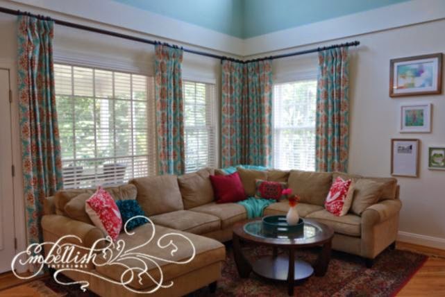
My client chose a fun bright print that pulls out the colors in the rug. Fun throw pillows and a turquoise throw break up the neutral sectional.
The room is bright and cheery, but more cozy too.
A big improvement, don't you think?
Need help finishing your Charlottesville home?
Contact Embellish Interiors
Ami Smith
embellishcville@gmail.com
434.465.0738                               434.295.3367

6.20.2014

Vintage Glam Living Room

I know I keep saying it.....but I really mean it -- I get to work with some fabulous clients! I truly enjoyed getting to know these homeowners and am excited to share this makeover.

My client wanted an update to his living room area. He takes care of his mother at home and was looking for a room for both of them.

I was immediately inspired by the gorgeous photos he had enlarged at Stubblefield Photo. These gorgeous pieces of art are of my client's mother and family, providing nostalgia for both my client and his mother, allowing her to remember people in her past when the present is difficult to remember for her.
 I couldn't wait to get them up!
The decor of the room was inspired by the photos - vintage, glamorous. We painted the walls a french grey and added accents of black and light blue taken from the shading in the largest photo. Reflective surfaces throughout the space give sparkle -- on the walls and the media cabinet.


Time for an update:
Gorgeous photos intermixed with black-framed mirrors fill the walls and comfortable seating allows for guests too. Lamps with black shades add to the glamour and a globe on the console behind the sofa was added for the well-traveled homeowner.
A beautiful secretary already in the room got a new upholstered chair with grey piping to match the sofa.

To provide ample seating and a special spot for his mom to sit at the window, we chose a sectional sofa with a chaise. A rotating table allows for storage and a place for a drink to perch.
A dramatic transformation!
Another amazing vintage photo of my client's family hangs in the entry.

It was a pleasure getting to know this mother and son and such a thrill to see them pleased and excited about their new space!

Need help updating your decor?
Contact Ami at Embellish Interiors
embellishcville@gmail.com
434.465.0738

6.16.2014

Blank Bedroom

My clients had very little furniture in their master bedroom. We started with a mattress and sidetables from the spare bedroom:
No furniture to hold clothing!
New everything! Green and tan bedding, an upholstered headboard and matching storage bench at the foot of the bed, striped window treatments and beautiful lamps finish the room.

A new dresser for storage and capiz shell accessories on another wall.


Bookshelves for even more storage and a pretty pinstriped chair for relaxing on another wall.

Much more relaxing!
Need help with your home?
Contact Embellish Interiors
embellishcville@gmail.com
434.465.0738

6.11.2014

Blank Slate

My clients moved into a new home and brought very little furniture with them. When I came, this was their living room:
We chose a soothing green-blue accent to the neutral walls and chose furniture to seat the family of five and guests.

Family photos on the back wall personalize the space -- their two year old proudly showed me the photo of her "as a baby".
Much more comfortable now!

Need help making your home more comfortable?
Contact Embellish Interiors
embellishcville@gmail.com
434.465.0738

5.12.2014

Decluttered Kitchen

In helping my client with the move to her new home, it was important to consider the utility of each space specific to her and her family. The previous owners used the seating area in their kitchen as a lounge space with upholstered chairs and had a lot of clutter on the countertops.
With a family of 5, my client needed to use that space for a table. And despite the number of children, there is no clutter. Seriously. Everything has a home and gets put away.
The new lighting makes a big difference. We replaced the two pendants above the island for a more streamlined single fixture. Potlights in the seating area were changed to beautiful pendants above the table. A new soothing paint color on the walls and the island adds sophistication.
And the island is almost unrecognizable uncovered!
The windows are softened with simple linen panels we could use from my client's old home.

Much improved!

Need ideas for your kitchen?
Contact Ami at Embellish Interiors
embellishcville@gmail.com
434.465.0738        434.295.3367

5.08.2014

Accessorizing!

Ah, the entryway -- such a small place to make a first impression! It should reflect who lives in the house, but not be cluttered. It needs to be functional, but not too utilitarian.........

Case in point:
 This family is way cooler than this entry indicates.

We gave the walls a new coat of grey paint and I went shopping.
Now it looks like:

Makes a great first impression!

Need help accessorizing your home?
Contact Ami
at 
embellishcville@gmail.com
434.465.0738                      434.295.3367

5.07.2014

Big Changes for a Big Dining Room!

I am so excited to share this gorgeous dining room.....and it's not even finished!  One of my amazingly awesome clients moved into a new home. I loved her old space so much, it was hard to see it go, but this one's even better!! And her beautiful things are fitting so well!  Check out the transformation:

Here's what the room looked like when she bought the house:

And here it is today:
You might recognize some of the furnishings in the photo at the top of my blog -- that's her old dining room!

Love it!! 
The Anna French wallpaper and fabric is to die for. Gorgeous drapery by Custom Interiors.
The hardware matches the finish on the chandelier chosen by the previous homeowners like they were made together!

Thanks for checking it out.

Looking for a transformation in your own home?
Contact Ami
Embellish Interiors
embellishcville@gmail.com
434.465.0738

4.30.2014

Maya Wood and Company -- Built-in Bookshelves

I really wish I had a photo of this completed space for you (working on it!), but since Maya has these gorgeous photos of his work in there, I'll at least show that part!!

My client purchased this beautiful older home after living in new construction and was having difficulty with furniture placement and storage in this room. It has gorgeous mouldings and rounded steps leading into it, but they family of 5 really needed to be able to use the space more efficiently.

This is the back wall of the room. On the opposite side is a beautiful fireplace (I'll get photos, I promise!!). The kids used this television for gaming and lounging when they had friends over. The sofa faces directly away from the fireplace and the room lacked light.
Maya and I designed this built-in to provide storage and lighting as well as an opportunity to showcase items.

Photo by Jen Fariello Photography

 By relocating the television to the other side of the room, I was able to incorporate a large sectional that can seat seven people and also allows for viewing the fireplace.

Integrated lighting in the built-ins brightens the space. Closed cabinet doors allow for concealed storage of toys, crafts and games.
Photo by Jen Fariello Photography

Another great collaboration!

4.29.2014

Maya Wood and Company - Banquette

I've had the opportunity to work with some amazingly talented local professionals here in Charlottesville and I am so proud to share with you the work performed by Maya Wood and Company for my clients! You can check out more at www.mayawoodandcompany.com.

First off, is one of my favorites, mostly because I love it when I pose a challenge and Maya accepts it and runs with it. Here's my "sketch":
From this scrawl, Maya's team built this:
Photo by Jen Fariello Photography

It fits the table perfectly and looks like it's always been a part of the breakfast room!
As you can tell, the worksmanship is gorgeous.
 
Photo by Jen Fariello Photography
 
 It's hard to tell from the photos, but the fabric has a metallic glaze, giving it a little sheen.

Photo by Jen Fariello Photography

The rest of the room is still a work in progress -- hope to be able to share more soon.
More beautiful pieces by Maya to come!