11.20.2013

Embellish the Halls!

I love the holidays.
I love decorating.
What could be better than decorating for the holidays?
Get a fresh perspective on old decorations.
Or, start anew with professional help.
Having a party?
Let me reduce your stress and make your home festive!
Contact Ami
embellishcville@gmail.com
434.465.0738                                 434.295.3367

9.24.2013

Great Room Makeover

In my first opportunity to work with this amazing client, I got to help with holiday decorations in her gorgeous home. I was so thrilled to hear from her later to get to make some permanent changes in her space. And don't worry - I've been back to change things up for the holidays, which is one of my absolute favorite things to do!

Today's post features the great room. This home is fairly new construction and while the bones were great, the feel was a little bland and contractor-like. The furniture placement also cut the room off, making it seem smaller.

My client wanted the home to have a farm-house feel and she loves neutrals. We started with the seating. The family of 5 needed to be able to sit in this room comfortably.


Two sofas replaced the sectional, allowing lots of seating, but opening the room between the eating area and seating area.  Two beautiful French antique chairs add even more places to relax and ottomans allow for even more seating with a tray for displaying items.


The fireplace underwent a major transformation:


 My client loved a salvaged mantle from a local farm estate from Patina Antiques, Etc. A new quartz surround adds texture and a new overmantle in an antiqued paint finish with a pair of sconces give the fireplace more presence. 


This view really shows how the new furniture opens up the space:

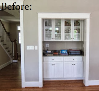
Another area that got an overhaul was an underused cabinet area. The homeowner wanted to create an office space for using the computer and paying bills. We removed all of the cabinetry, added gorgeous Anna French wallpaper, a custom desk made from local reclaimed wood and some display shelves. A new swing arm wall sconce allows for desk lighting.


The kitchen area got a transformation, too.
Stay tuned!

Need help with your home?
Contact Embellish Interiors!
embellishcville@gmail.com


9.03.2013

Improved Entry

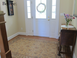
 This entry just needed a few finishing touches:

A round rug adds interest and new consoles fill the space. 
A beautiful bench and some vintage accessories complete the look.

It makes a great first impression!
Need some help with your home?
Contact Embellish Interiors.
434.465.0738       434.295.3367
embellishcville@gmail.com

8.26.2013

Dramatic Dining Room

Thanks again to Kim Veillon for the photographs featured in this post. Today's makeover features a dining room that transformed into a much more formal space.
 Wallpaper was this biggest impact for changing the feel of this room. We chose a Candice Olson green-blue metallic wallpaper with crystal details. The way the light bounces off of the metallic and crystal finishes is gorgeous by day and even more dramatic at night. We also chose an oblong chandelier with a bit more sparkle to really fill the space above the table.
The client loved her furniture as well as the beautiful silk drapes made by Sarah Woodson of Pretty Pretty Please Designs. She also wanted to incorporate a family vintage piece for displaying china. We balanced the room with a curved storage piece in the opposite corner. Using a mirrored tray to anchor the items for the centerpiece, a series of botanicals on a simple burlap runner keep with the farmhouse look of the rest of the home.
The buffet got a complete transformation too with the addition of a dramatic mirror flanked by large lamps with dripping crystals that coordinate with the chandelier. We also relocated the wine storage to a new wine chiller elsewhere in the house.

After photo courtesy of Susan Kalergis Photography 

A pretty big transformation!
Need help changing the feel of your room?
Contact Embellish Interiors!
embellishcville@gmail.com
434.465.0738                      434.295.3367


8.15.2013

Beautiful Bedroom

The after photos I'm using for this post were taken by Kim Veillon. I am so grateful to be able to share photos that actually capture my designs and am thankful to Kim for sharing her talents with Embellish Interiors. Stay tuned more more pretty pictures from Kim - so exciting!

Despite a couple of hiccups along the way (took 3 tries to get to this duvet due to fabric flaws and discontinued prints), I love how this bedroom turned out.  The pendant lighting beside the bed has to be my favorite part.  The beautiful antiqued crystal pendants were installed with dimmers and are controlled with remotes separately of one another to allow for night time reading on one side and peaceful sleep on the other. Without placing lights on the nightstands, we were able to create a small reading nook on one side of the bed with a little table to place a book or cup of tea. The sconce lighting originally in the space was too narrow for the headboard and didn't allow much room for decor above it.

The photos above the headboard were originally in the shelving unit between the bed and sitting areas.  While I love the use of family photos, the shelves seemed a little cluttered and busy.  The ledge above the bed adds a rustic element to the space and silver frames on it add a little sparkle. I replaced the items on the shelves with an eclectic mix of white accessories and topiaries.


On the side opposite of the bed, I added large mirrors above the dresser to add drama to the simple lines of the piece of furniture.


Baskets are also incorporated throughout the space to contain clutter and add storage. 
Another relaxing retreat!

Need help with your bedroom decor?
Ami would love to assist!
embellishcville@gmail.com
434.465.0738

8.13.2013

Reconfigured Family Room

I truly have had the opportunity to work with some amazing clients over the years and am so grateful for their willingness to open their homes and share their family experiences with me. I have so enjoyed working with this client.  She is the most amazing hostess and her family is just as warm and kind.

This project has taught me a lot, aside from how to treat guests in my home! I had to step out of my decorating comfort zone (I've never been asked to find a fabric that was "more tribal" before!), but I love the result -- a comfortable, relaxed, eclectic feel that reflects the remarkable family that lives there.  I still need to take photos, but here's a quick peek of the newly recovered sofas, chair and ottoman as well as a new display shelf, comfy rug and custom coffee table made of reclaimed wood. And, here's proof that I don't always do window treatments!
Stay tuned for more photos!
Looking to pull together a new look for your home?
Contact Embellish Interiors!
embellishcville@gmail.com

8.07.2013

How to (better) Hang Drapes (and why ready-made drapes should come in longer lengths)

I have worked with several clients who were fearful that I would come into their home and fill it with fancy drapery. I assure you that I do not force window treatments on anyone and am not of fan of fussy windows.  I do; however, think that adding drapery to a window completely transforms a whole room and can be an inexpensive change for interiors needing a pick-me-up.

If you do subscribe to the drapery thing, how your drapes are hung really makes a difference. There are tons of posts out there about this -- my favorite includes this image:
http://horchata-jessieleigh.blogspot.com/2012/04/how-to-hang-curtains.html
This pretty much shows it all: a curtain hung correctly makes the window, even the room, look larger and softens the space. You will notice also that the fabric does not have to cover important natural light coming in. 

Easy enough -- BUT, if you are trying to cut down on costs and purchase ready-made drapery, most stores have 84" long drapes in stock, which are not long enough to achieve this look in most homes. This is typical for homeowners who have tried installing on their own:

Such cute shades from World Market, but the dark horizontal line across the top shortens the window and the wall.

Some stores have caught on (World Market now carries some of their drapery in 96"length in the store), but most will offer longer lengths online.  It is worth spending a few extra dollars (and maybe some shipping fees) to hang your drapes the right way. Here is the same window now:
I may be a bit partial to the cute new fabric too, but the room feels completely different now!

Hope this helps with your window dressing decisions, but if you're still wanting help, give me a call or write me an e-mail.  I love this stuff!
Ami
embellishcville@gmail.com
434.465.0738


7.17.2013

Modern Blue and Grey

Hello, poor, neglected blog!  This summer has been so very insane!  But, I've been busy with fabulous projects and am so very blessed to get to work with so many amazing clients!! I hope I can share more regularly soon.

My post today features a brand-new condo.  We started with virtually a blank slate.  My client had purchased a sofa, two accent chairs, a big TV and a lamp.  Otherwise, the place was empty:
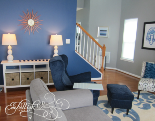
My client wanted something modern with accents of blue.  Here's what it looks like now:

I think I may have scared her a bit with my blue color choice, but she finally came around to the idea and now loves the bright pop against the cool grey walls.  A large bookshelf/entertainment unit fills up the family room wall with fun silver and white accessories and baskets to hide storage.  I am a huge fan of the Ikea Expedit units -- you'll see them in a lot of my designs.  They're amazing for storage, inexpensive and come in many colors.  They can be used vertically or horizontally and can be combined to create configurations like this one.
Here's another view of the bright blue wall:

My client uses a door to the left of this console to enter the house through the garage.  She needed a place to put her keys and mail and this piece fits the bill.  Love the white gourd lamps against that blue!!  We will get more storage trays for the smaller openings.

I had a lot of fun with the very blank entry to the home -- just a long hallway:
We added a fun stripe in a darker color of grey, which is used in the hall half bath and added some fun mirrors.  These mirrors started out a boring oil-rubbed bronze, but a quick spray of blue paint gives visitors a glimpse of the decor to come in the rest of the space.  (On a side note, I didn't realize I'd also painted my foot and had a brief panic when I thought I'd lost circulation in my leg later that evening!!)  I think it turned out really cool:
More modern touches were added to the half bath as well.  Those tiny spaces are really difficult to photograph!
    A fun, chevron temporary wallpaper was super-easy to install and adds a great punch to the wall behind the toilet.
 We still have more to go....waiting on some stools for the kitchen and a few more drapes for a dramatic wall of floor to ceiling panels.....hope to be able to share the finished product soon!

Is you home in need of Embellishing?
Ami would love to help!
embellishcville@gmail.com
or
434-465-0738


5.07.2013

Dramatic Master Bedroom

This homeowner contacted me to help with her bedroom -- nothing huge needed, just some finishing touches.  The space was transformed with fabric.

Before, the bedding was worn and tired, the windows were naked and that wall behind the headboard needed something.
I created a focal point above the bed and filled up the huge vaulted ceiling wall with a couple of drapery scarves.  Taffeta drapes in silvery blue and taupe stripes dress the windows.  New bedding in gold, silvery blue and taupe bring it all together.

Another view of the dramatic wall treatment.  This was created using a curtain rod behind a cornice valance.  The drapery scarves were hung over the rod and the top layer pulled back with drapery hardware.  The fabric adds warmth and color and texture to the space.

New accessories on the dresser are the finishing touches.  It's so nice to have a finished bedroom to retreat to at the end of the day!

5.03.2013

Office Spruce Up: Storage Room

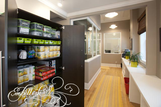
Having a designated place to store things helps to reduce clutter.  This storage space in a downtown office building is a good example.  Without organization, this room became a dumping ground.
It took an entire afternoon, but I went through every box and organized the papers and supplies.  The supplies went in a new large storage cabinet.  I warmed the space up with some paint, plants, a sunny runner, natural blinds on the windows and some vintage-y office art.
All of that stuff in here:

An organized, Embellished space!

4.29.2013

Orangery

 This makeover is part of an assisted living renovation. Before, the design was very institutional.  And dated.  The dark carpet, vinyl upholstery and floral prints needed to go.
I chose an interesting taupe and green-blue 
leaf print carpet for the floor and neutral tan for the walls.
The beautiful mountain views are now framed with taupe and green plaid cotton drapes.

I developed an orangery theme for the space, featuring citrus decor with pops of yellow and orange amongst the neutral tones.
 A faux lemon tree fills the corner of the room.

Another look at the other side of the room before:

And here it is now:

 The seating area before:

Embellished:

 A nice improvement!